- 94 survey responses
- 6 usability tests
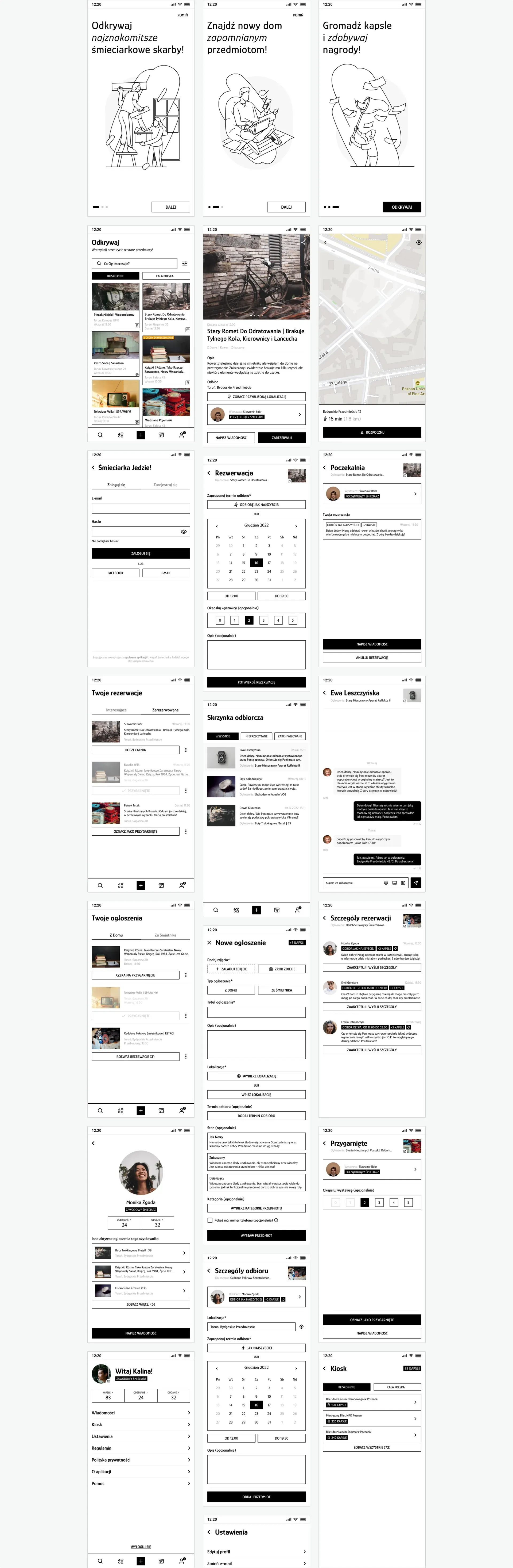
- 30+ screens
- 4 weeks solo, end-to-end
- Role
- Solo — research, design, prototyping
- Methods
- Netnography, surveys, IDIs, usability testing, UX/UI design
A concept app for giving away and picking up unwanted things. Inspired by Polish Facebook swap groups like “Uwaga, śmieciarka jedzie!” (“Heads up, the garbage truck’s coming!”). From netnography through interviews and a survey to a testable prototype.
I started by observing real conversations in Facebook groups — how people described items, negotiated pickups, and talked about trust. Reading existing posts let me see what worked, what didn't, and why. That groundwork shaped the first research questions:
What items do people give or take away?
How is communication working between the giver and the recipient?
How do users proceed with reserving or obtaining items?
How do users feel about the various stages of the experience?
Having a set of research questions, I decided to conduct a quantitative study that would help me understand the characteristics of the target group. The study involved 94 people who belonged to the Facebook community group.

In order to explore the thoughts, emotions, and motivations related to giving and receiving items within the "śmieciarka" community, I conducted a series of interviews with people who passed the screening questions.
I categorised the obtained data using empathy maps.
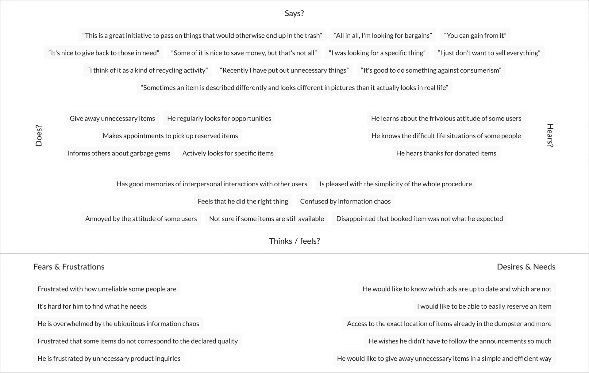
The obtained data allowed me to create hypothetical personas that became the foundation for further conceptual and design work.
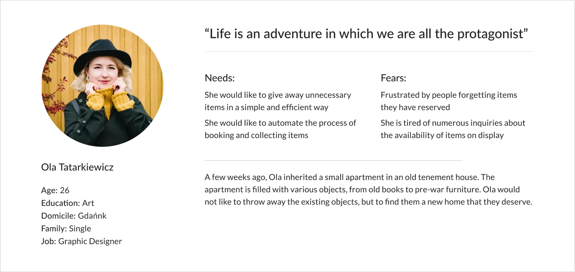
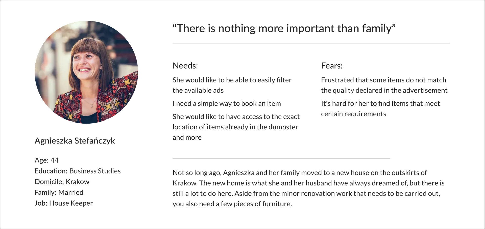
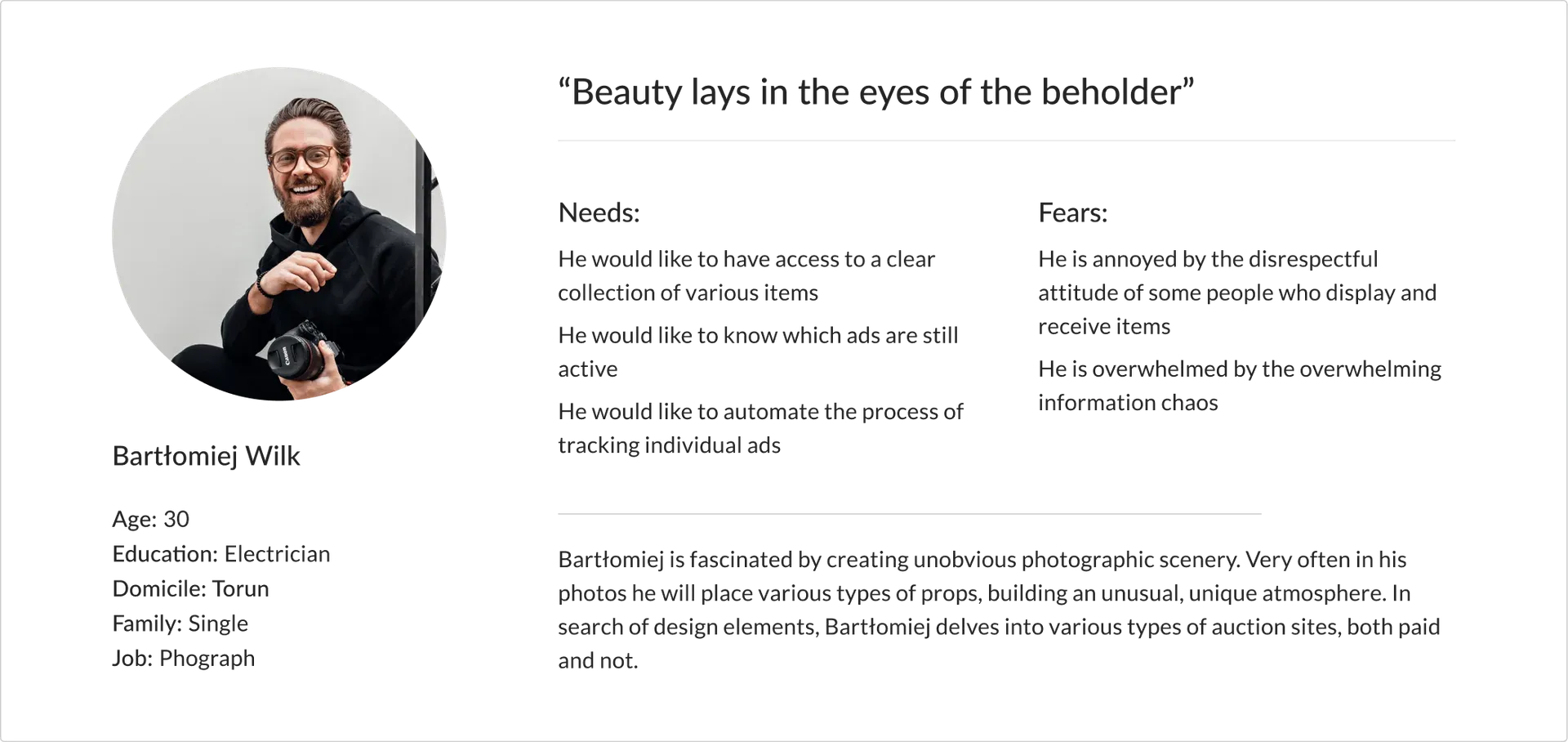
Personas along with their assigned needs, motivations, and emotions allowed me to simulate the experience of giving and receiving items.
On the basis of my observations, I defined the following key design goals:
Easy decision about what’s right for me.
No unnecessary confusion.
For both the giver and the receiver.
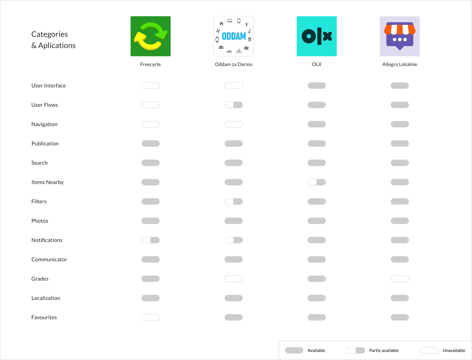
With clearly defined design goals, I could freely move on to creating solutions. Analysing the competition — both direct and indirect — helped me better understand the strengths and weaknesses of existing products.
Rephrasing identified problems into simple questions starting with "How might we...?" allowed me to look at design challenges from a fresh, more creative perspective.
How might we remove the need for users to constantly follow the announcements?
How might we increase user engagement?
How might we make sure users can find what they need?
How might we reduce the abandonment of reserved items?
How might we improve communication between giver and receiver?
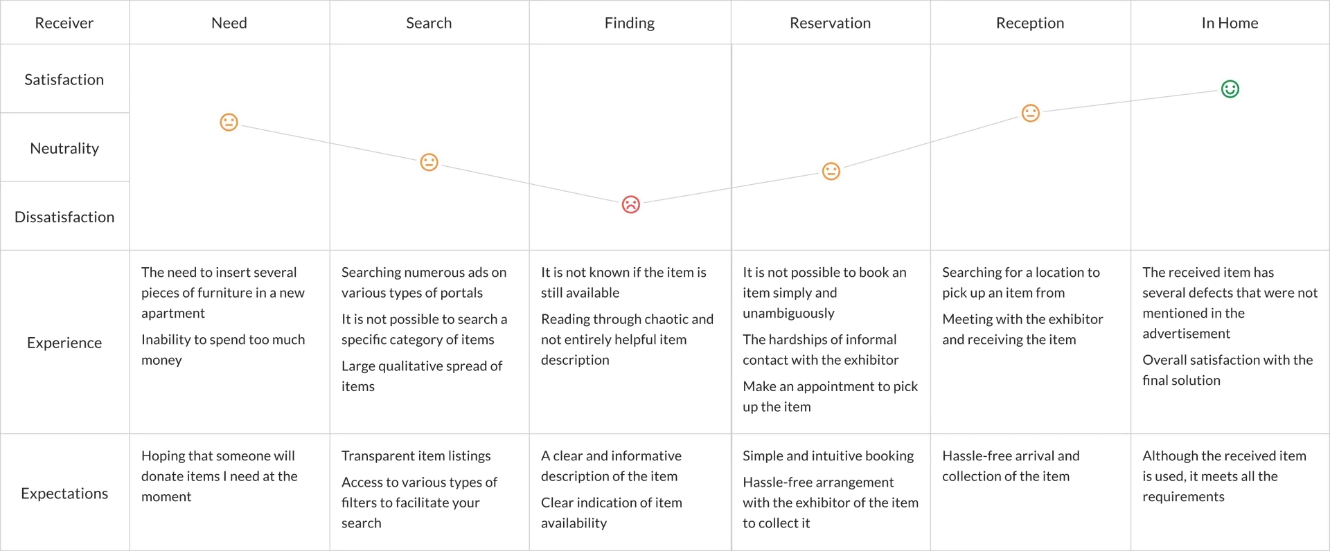
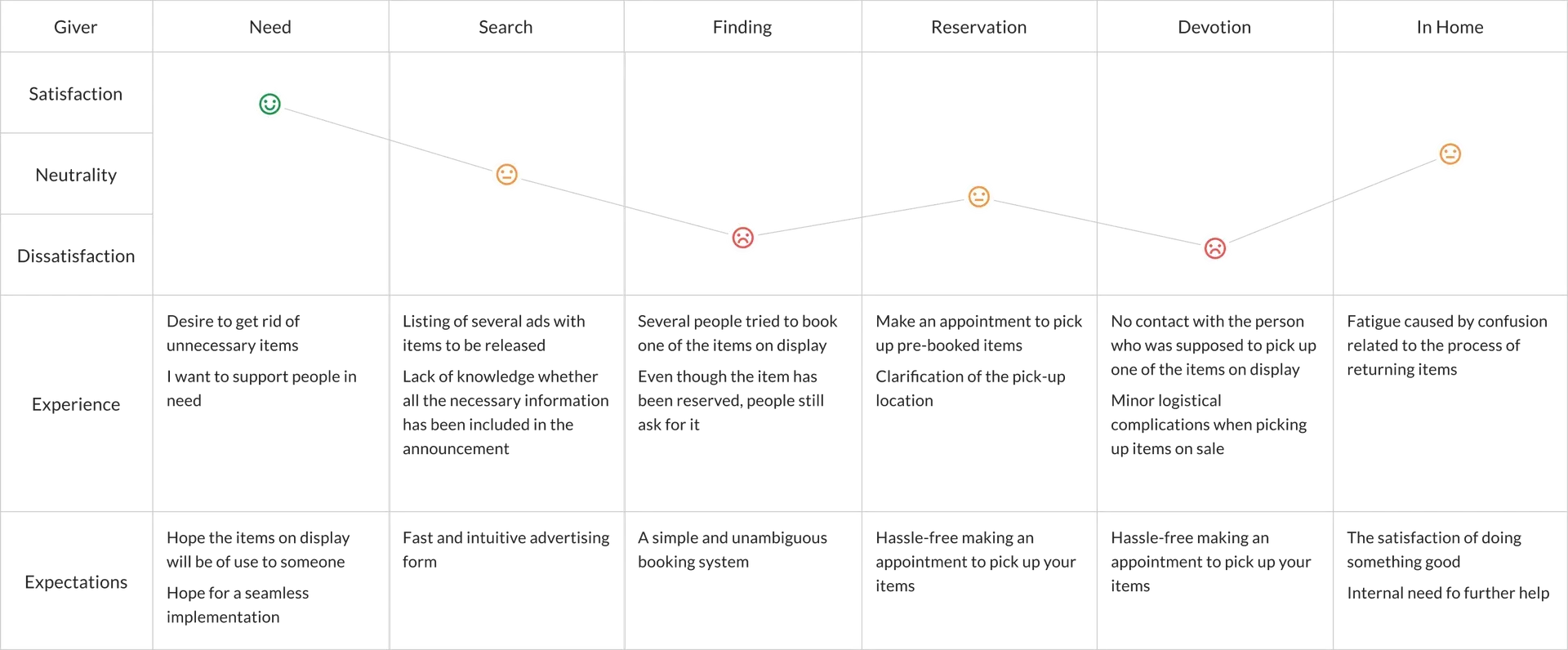
With defined design goals, assigned solutions, and previously developed artefacts, I designed the key processes the product would support. By mapping the main user paths, I captured the flow of giving and receiving items.
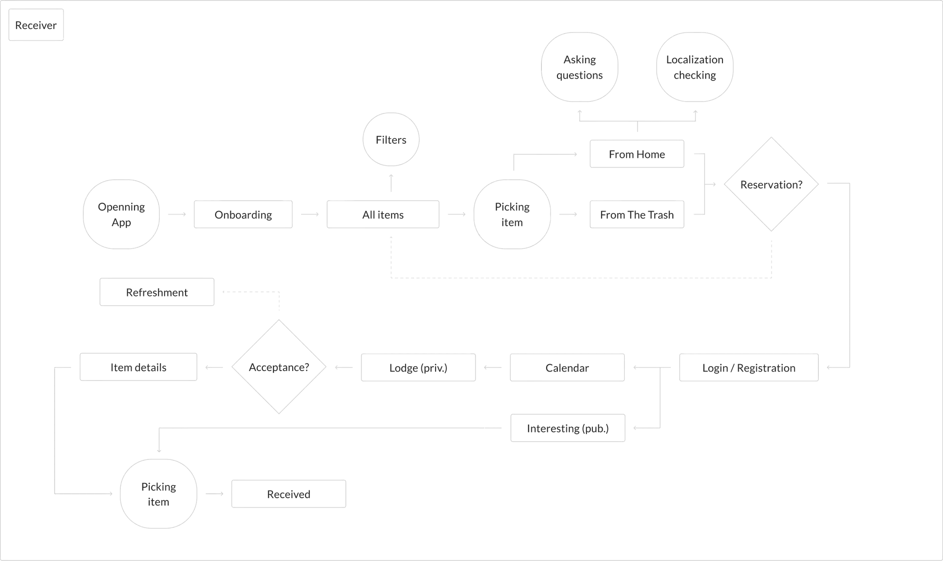
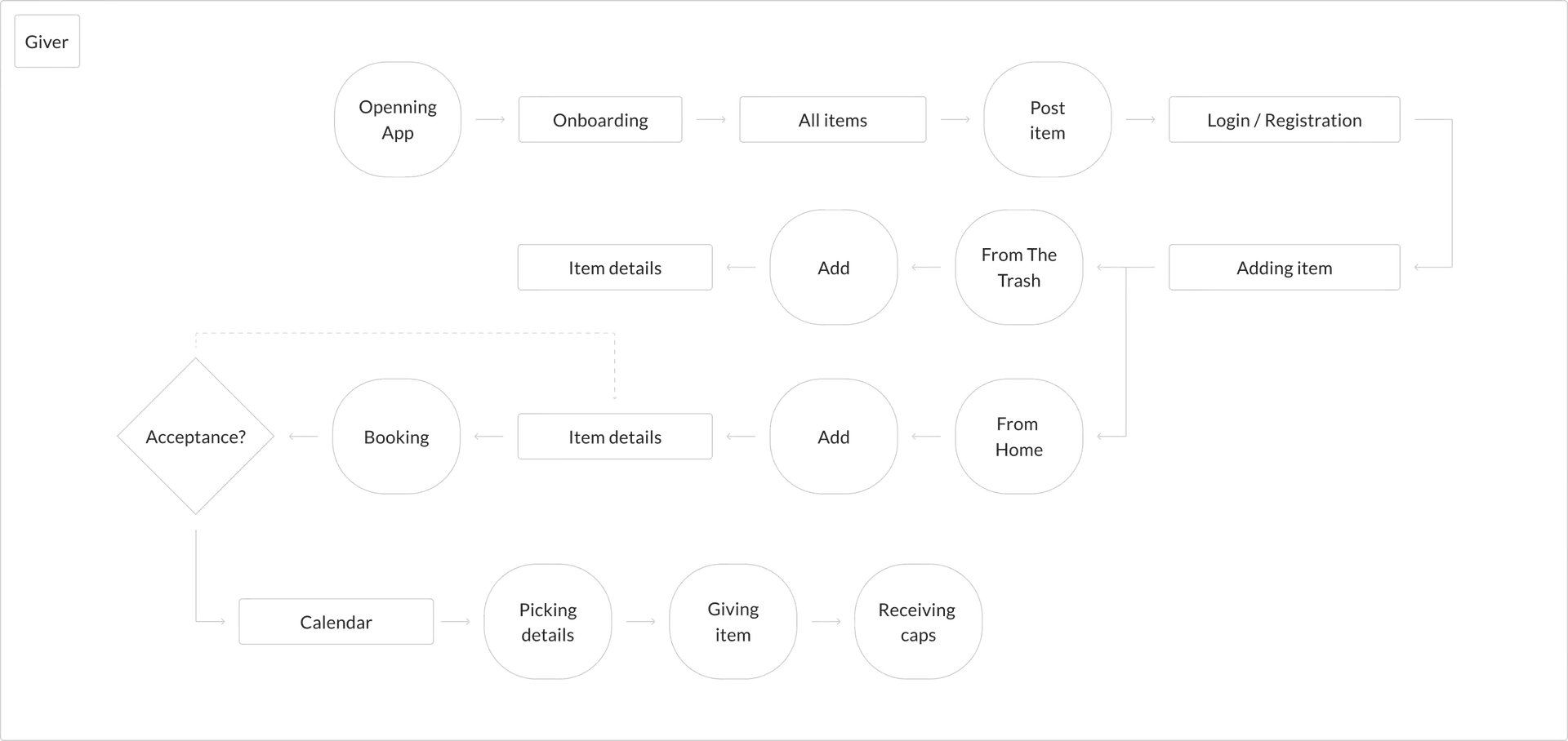
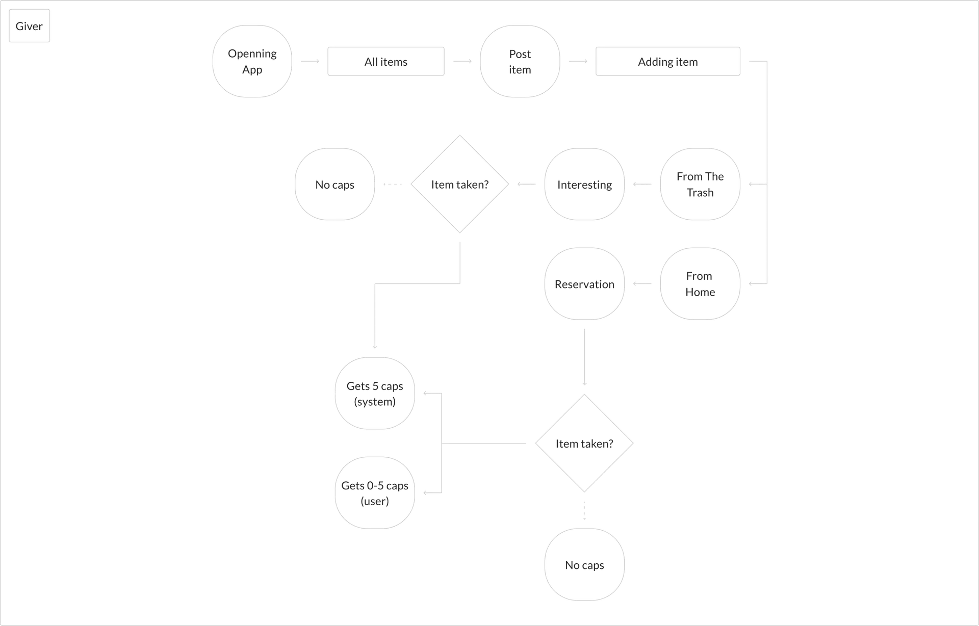
One of the solutions to increase engagement and satisfaction with the application was a reward system. For this purpose, I designed a mechanism for earning virtual bottle caps.
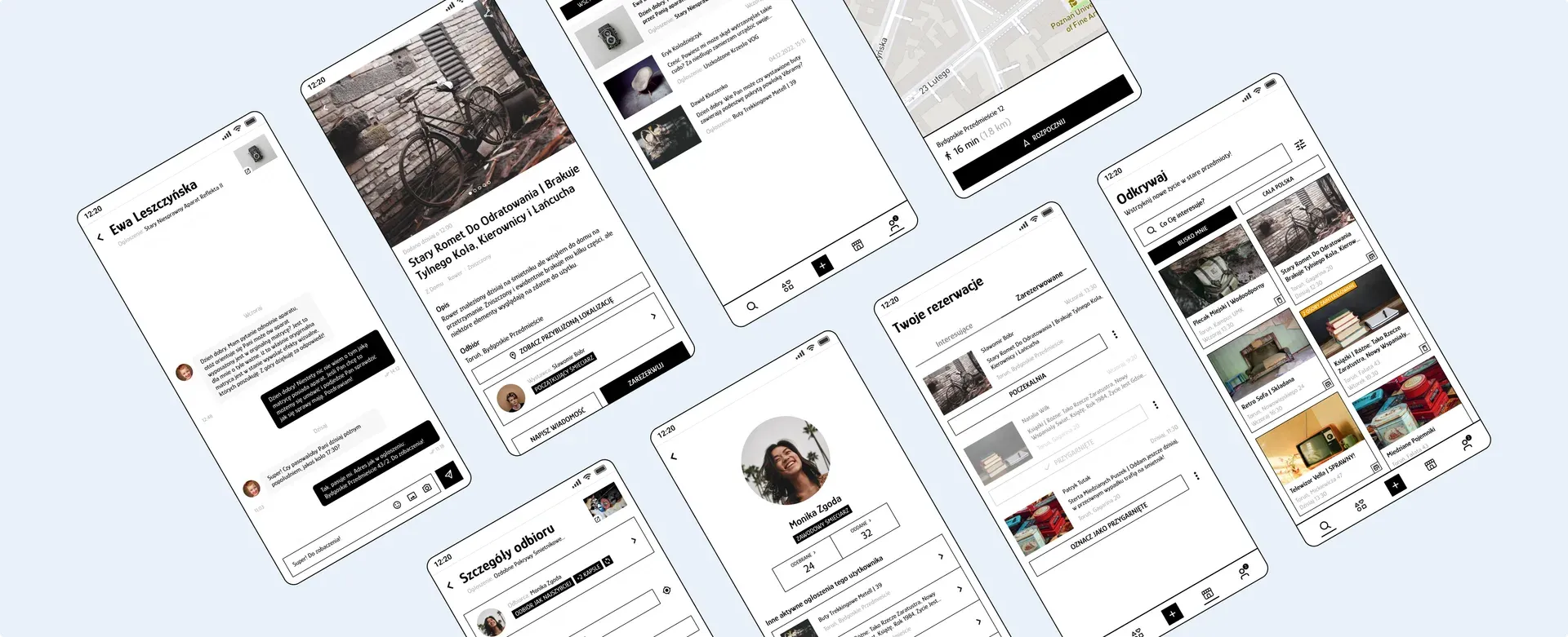
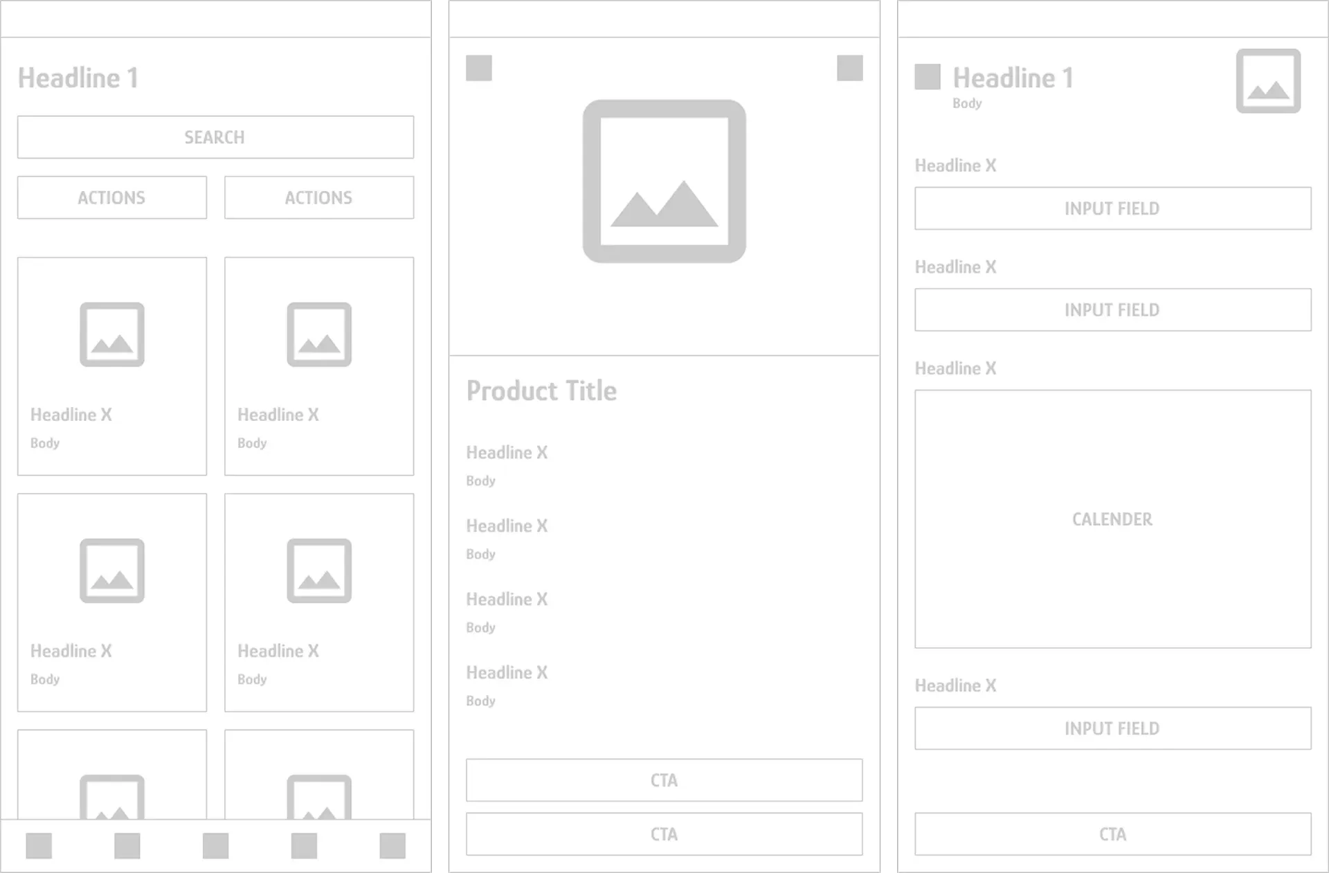
Access to user journey maps allowed me to move on to visualising specific functionalities at the level of individual screens.
Based on initial component sketches, I created more detailed wireframes, which then served as the basis for preparing a testable prototype.
After combining the produced screens into an interactive prototype, I was able to validate the proposed design solutions.
I recruited 6 people for moderated usability tests. After a short briefing, participants worked through tasks covering the usability of the app’s core flows.
Most of the survey participants had a problem finding the button to post an advertisement
Several people would like to be able to arrange a suitable pick-up date in advance
All the surveyed people said that the gamification system is understandable
A few people rightly pointed out that when considering a reservation, an additional decisive factor is the speed of its submission
Several people talked about the usefulness of the quick message filtering functionality
After many iterations and changes, I brought the product to its "final" version.
Netnography turned out to be the most valuable step in the entire research process. Before I formulated a single research question, I spent several weeks observing "śmieciarka" communities on Facebook – this let me understand users' natural language, frustrations, and unwritten rules before I even began designing the survey and interview scripts. As a result, my research questions were sharper and conversations with participants got to the core faster.
It was also my first project done entirely solo. Without a partner to challenge my thinking, I had to be more deliberate about questioning my own assumptions – the personas and journey maps served not only as design artefacts but also as tools for testing whether my understanding of the problem was coherent.
I would run a second round of usability testing. I stopped at one iteration, which means I never verified whether the fixes I introduced actually solved the detected problems. Next time, that validation would be a fixed part of the process – one study reveals what doesn't work, but only a second one confirms the fixes landed.